Showing posts with label lettering series. Show all posts

Tuesday, June 27, 2017

creating with make wells- 3 tips for finding your lettering style AND A SALE!


Hello! It's Megan here with another lettering post but I also wanted to let you know that I've got my lettering classes on sale this week.

You can head on over to Alisa's shop HERE for more details.

There’s no way around it people, hand lettering, brush lettering, calligraphy - all of it - it’s popular right now.  If you are reading this, then you probably have jumped on the Letter Bandwagon - so welcome to the club!

I’ve been working professionally as an “artist who draws letters” now going on 5 years, and I’ve worked REALLY hard to try and create my own style and “look.” And trust me, in a sea of talented lettering artists, it’s tough to create your own little niche.  But truly, the best compliments I ever receive are when people say, “I knew as soon as I saw this that you made it!”. That makes me swoon, and inspires me to keep creating what is ME.

So, today I want to share with you 3 Tips to Help you find YOUR lettering style!


So here’s what I mean - because there is nothing wrong with tracing as a way to practice. Just try not to rely on tracing alphabets with fancy pens as your sole source of learning and practice.  


Pick up a pencil and a blank sheet of paper and start drawing!


Tracing is a great way to practice strokes with different pens and is especially useful for practicing brush lettering techniques - but if you don’t learn to really DRAW the shapes of letters on your own, you might find it harder to branch out and discover new styles - and ultimately YOUR style!


There came a point in my artist life where I realized I was spending WAY too much time looking at other people’s work. Don’t get me wrong; I love admiring the work of other artists and learning from them,  but I found I was spending just as much time looking, as I was putting my head down and making.

And that affected my work. And my originality.

So put your head down and practice. If you want to achieve a style that’s YOURs, make sure you spend just as much time practicing without feeling the need to constantly reference Pinterest or Instagram for inspiration. That’s going to force you to pull from within and rely on your own creativity.

Of course we all love to look, pin, and like - just make sure you balance that with healthy doses of shutting off the screens and flying solo with your paper and supplies.
Sometimes there can feel like there are a lot of rules you just don’t want to break with lettering - achieving perfect curves, drool worthy flourishes, consistent weight, blah blah blah.

But you know what also looks cool? Imperfect letters.

I won’t pretend I haven’t seen a piece before and winced at how goofy looking the lowercase g looked. It happens. Sometimes people draw really bad looking letters. I mean, let’s just be honest here. Not every imperfection is going to be a homerun in the lettering proverbial ballfield.

But imperfections are often interesting. My work is quirky and whimsical and expressive, mainly because my strength is NOT being super perfect and precise. I tend to be impatient, which can lead to messy-ness. But instead of fighting against this “weakness,” I’ve just embraced the way I like to work, and that’s helped me create a style that feels very ME.

I hope those 3 little tips will help get you on your way to finding your own lettering style!


Xo, Megan


Instagram @makewells

Be sure to check out my lettering classes here!


Wednesday, April 26, 2017

lettering outside the lines is here!


Hey friends we've got another fun class that drops today! Here is a little peek!


LOL Intro from Megan E Wells on Vimeo.

Letter Outside the Lines
Starts April 26th
$30.00
For more details or register for class HERE

Join Megan Wells of Makewells for another fun and creative lettering class!
Take your lettering to the next creative level in this fun, “outside the box” class where Megan’s bound to help you break a few rules! Using a wide variety of materials and techniques, she'll share her favorite ways to take her original, hand lettering artworks beyond the pencil and pen, while walking you through her process of experimenting with letterforms and materials in her sketchbook.  

Wednesday, September 16, 2015

makewells: my sketchbook process


Hi! It's Megan here from Makewells again, and today I'm blogging about my sketchbook process. 

Right now, I'm working through a 365 Project - completing one full page in my sketchbook each day and posting to instagram. So today I wanted to share just one of the (many) ways I approach a blank page. 

As far as supplies go, I use just about anything and everything in my sketchbook. I do tend to use "cheaper" paints, including craft paints that I pick up whenever I pass that aisle in the store. But I also use pens, paint markers, and colored pencils.  
My sketchbook is a Canson mixed media spiral bound book. The paper is not super thick, so I do have to flatten out the pages sometimes when using a lot of water. But I prefer to keep it on the cheap for my sketchbook, and this is a great value for what you get!

To begin, I like to quickly cover the page with acrylic paint. I try to do this without really thinking too much. Same goes for choosing colors. My approach to working in my sketchbook is that it should be loose and a place to "explore", so I often choose colors at random and challenge myself to make them work together. 

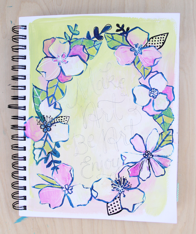
My go-to subject matter in my sketchbook is florals. I just love painting flowers, it relaxes me. And I feel like there are INFINITE ways to paint flowers, so it's a subject matter I love exploring. Above, I used a small brush to "draw" in some flowers. 

As I started painting, it just seemed natural to make a floral wreath. So that's what I did, adding leaves and little branches. I started to realize at this point, that this would probably be a page incorporating a hand lettered phrase, so I started thinking about what that would be as well. 

I then began blocking in some color inside the floral line drawings, slowly building up to painting a little bit more detail.

Using my favorite white Uniball Signo Gel Pen, I started adding fine lines on top of the paint.

And eventually, I added some leaves with a polka dot pattern inside. I love incorporating patterns in my sketchbook pieces - polka dots, dashes, etc. are an easy way to add unexpected interest.


I finally settled on what phrase I would draw in: "Make Art. Be Art. Enjoy." This is a phrase that I often draw, but it means a lot to me.  My mom said this to me once when I was having a rough day in my early 20's. She emailed me an encouraging note and said, "Just go make art. BE ART. And enjoy." I just love that, and I often create pieces incorporating that phrase. 
I lightly drew in my lettering with a pencil before painting. 

Because it's my sketchbook and my goal is to be loose and creative, I don't worry about stray pencil marks here and there or "perfection". 

I do love "finishing" a page with colored pencils, however. I love the way Prismacolor pencils work with acrylic paint when it's dry, so I often use a very sharp, darker pencil to give drop shadows to my letter and a little more detail to the florals. 

And then I call it a day! 
So there you have it: a little glimpse into my creative process while working in my sketchbook. As I said before, every day is different, but I always try to "not think" and let the page just "happen". By doing that, I allow for happy accidents and unexpected discoveries. 
I hope you enjoyed seeing my process! Don't forget to post your own lettering projects on instagram using #redefinecreativelettering 
Xo, Megan
@Makewells (instagram)

Tuesday, August 25, 2015

floral alphabet with makewells


Hello! It's Megan from Makewells and I'm back with some more lettering tips and tricks! Today I'm showing you a creative way to add a little flair to your lettering. 

I'm obsessed with drawing/doodling florals, so today I am combining two of my favorite things: lettering and flowers!

If you've followed along with my lettering series, you'll know that I always like to start out with some basic pencil sketches. For this project, I decided to create an alphabet, so I quickly worked my way through the 26 letters to come up with the forms I would use for each letter.

After finalizing my sketches, I created each letter to go in my floral alphabet. Below, you'll see the step by step process:


1. Lightly draw the basic form of the letter
2. Thicken downstrokes
3. Erase area you'd like to put the flower, and lightly draw in


4. Ink (I used a Micron pen - just make sure you use a pen that is waterproof)
5. Use watercolor to add a splash of color to the flower. 


That's it! An easy way to add a little flair to your lettering. 

For the alphabet I created, I mixed up the places that I added the flowers, depending on the form of each letters. 

Here's the entire alphabet:


Another alternative is to paint the letters and flowers in acrylic. I followed the same steps sketching, but then used acrylic paint for both elements instead of ink and watercolor.


Of course you don't have to do just flowers. Get creative with other elements to create your own series! Bugs, bows, sea life...anything goes!


Have fun applying this technique to any of your lettering projects. I decided to send some extra happy mail to a friend, using the floral alphabet for the first letters in her name and city. 


Happy creating! Don't forget to post your projects on instagram using #redefinecreativelettering 

Xo, Megan
@Makewells (instagram)

Monday, August 10, 2015

DIY letter blocks from makewells


Hello! It's Megan from Makewells once again and I'm here with a super fun decor project, DIY Letter Blocks!
I'm constantly changing up the decor around my house, so this is a fun way to add a pop of color and easily switch out a word or phrase. 
First, I cut my wooden cubes. I made them 3" because I had a 3" x 3" piece of cypress wood on hand. If you don't have tools handy, you can find wooden blocks online in just about every size imaginable. 

After giving the blocks a nice sand, I used acrylic based paint to block in colors on each side. Because I skipped on priming the wood first, I had to use a couple coats on each side. I like to jump in with color right away, but if you aren't a step skipper like, go ahead and slap a primer on there. 

I wasn't too concerned about perfect edges, because I knew I was going to sand those back down eventually. So, if you're a perfectionist, I apologize for those sloppy edges!
Next, I lightly drew letters on every side using a pencil. My only organization of this was to do 3 blocks with all vowels and the rest mixing up the consonants. I had a few words in mind that I wanted to make sure I could spell out when finished, so I planned accordingly. 

And then I painted my letters! I mixed up the colors I used, and of course added some bold drop shadows to make them really stand out. 

Once each block was completed, I went back with the sand paper and sanded down all the edges again. 

To give my blocks an aged look, I used one of my favorite crafting products: Tim Holtz Distress Stains. These come in a ton of colors and for smaller projects make staining super easy and not as stinky or messy. 


I then used another favorite product: Annie Sloan soft clear wax. This stuff is pricey, but I just love using it on wood projects. After rubbing it in, I very gently re-sanded the blocks. It gives the wood a really nice, velvet-y feel. But if you don't want to splurge, just use some mod podge or any acrylic sealer.

Once dry, I had a great set of blocks to play decorate with! 


Have fun creating everyone!

You can check out all of my lettering posts HERE and don't forget to share your progress using #redefinecreativelettering. 

Xo, Megan
@Makewells (instagram)

LinkWithin

Related Posts with Thumbnails