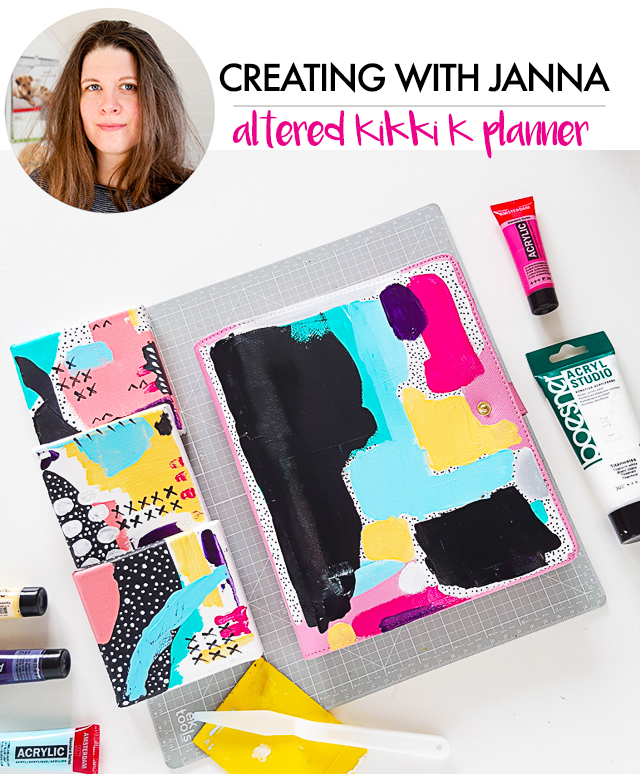
One of my friends talked me into buying a fancy planner, it was a big hype and nearly everyone in my surrounding owned one. I never used this kind of organization tool before and didn't really think I needed one, but you know how it goes... and to be honest, there are really nice ones out there. I ordered one from Australia which was not only quite expensive, but also plain pink. When I opened the package, I was disappointed, the planner was a bit boring to look at, so I put it into a drawer and didn't touch it for a while.
Then, when I was working on a few small canvases, I got the idea to transfer the patterns onto the expensive planner. My friend nearly got a heart attack and was worried what would happen if I messed up - I did it anyways. So here is a little inspiration how to upgrade a planner using yourself and your projects as source of inspiration.
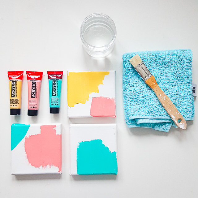
To begin with, I'd like to share the process of creating the small mixed media canvases. I chose three different pastel colors to start with and applied the acrylic paint with a paint brush. I prefer to color the edge as well, but you don´t have to.
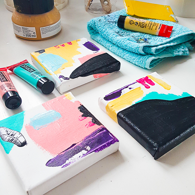
Adding darker colors creates contrast and depth. In this case, I chose a dark purple and black. Big, dark areas can feel intimitading sometimes – don´t forget, you can lighten up those areas by applying more paint or white colored shapes, for example.
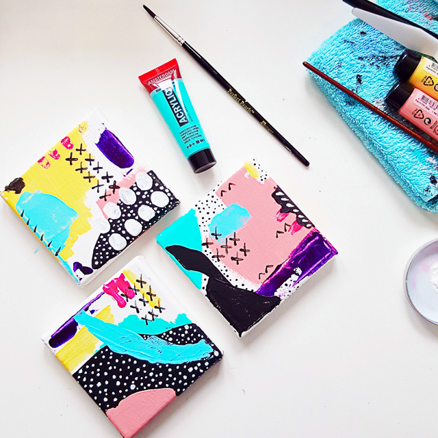
Creating those mixed media canvases didn't take long, it was fun and a great practice. As mentioned before, I got the idea to transfer the patterns onto the pink planner during the creative process. I wanted to make the planner more "me" in order to finally use it.
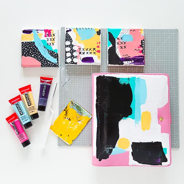
I started with a base of white acrylic paint to make sure the other colors would pop out. I also left a few spots with the original pink. The color was applied with paint brushes, credit cards, scrapers and my fingers (which makes it even more personal). The color scheme is the same as on the canvases, so are the shapes.
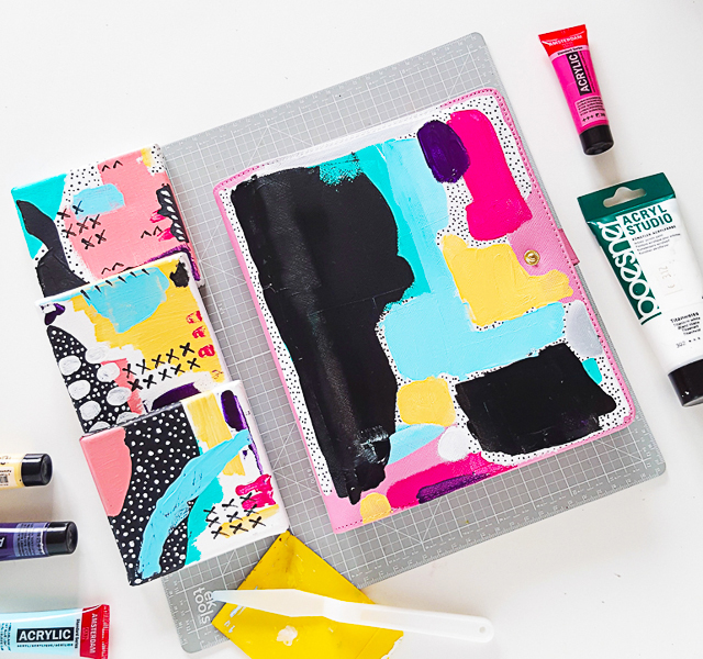
Painting the planner took much longer than the mixed media canvases. I stepped away from it a few times, to return the other day and keep on working on it. The backside is still plain pink, I didn´t want to overdo it and I am happy I didn´t paint it as it lets the front pop out even more.
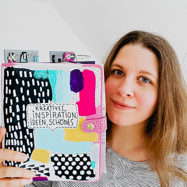
As you can see, I added lots of small shapes like dots and dashes to the dark and light areas and created a white center for the title.
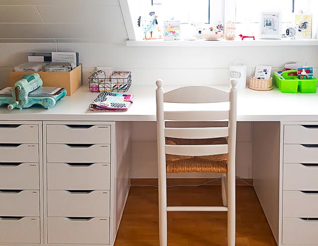
The planner lies on my works desk – it has become a file in which I store inspiration, ideas and creative things. I absolutely love how it turned out and the fact that I was my own source of inspiration makes the project even more unique and fun.
So, whenever you run out of ideas or creative mojo, flip through your projects and find out what you like about them and try to incorporate this into a new piece.
All the best,

Love it!! Well done, Janna!
ReplyDeleteBest wishes, Doro.
Wow, I love how your planner turned out! And the small canvasas too! I like your color-combination.
ReplyDeleteAnd I love your clean working space!
xo
anne